Background
Hearts of Hope is a 501(c) non-profit organization, that was started in the summer of 2018 and whose purpose is to help homeless youth in the Baltimore area with things such as getting into stable housing, offering educational resources, and assisting with childcare. Over the past 3 years they have provided services, such as care packages and resources for affordable housing, to countless homeless youth and young adults.
The current design of the Hearts of Hope website has three design flaws at first glance: 1. It has poor navigation, some of the pages are mistitled, has redundant information spanning multiple pages, and containes information not inline with the rest of the page content, 2. It has poor readability, meaning on some pages it’s difficult to differentiate between links and content, and 3. overall it is not very aesthetically pleasing, with the current scheme.
The goals of this project are: 1. improve navigation with the help of a new site map, 2. improve readability by clearly differentiating between headers, body text, and link, and 3. improve the branding to be more aesthetically.
Research
SWOT Analysis
The first step of this redesign process was to conduct research about the organization in order to learn about the strengths, weaknesses, opportunities, and threats about the organization. This information helps me as the designer understand what the organization does well and areas they can improve upon. This analysis provides information to build on and determine placement of information for the redesign. For example, given that a major source of funding is donations from the community, this information needs to be readily available.
User Personas
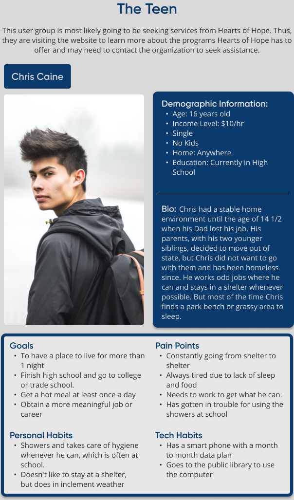
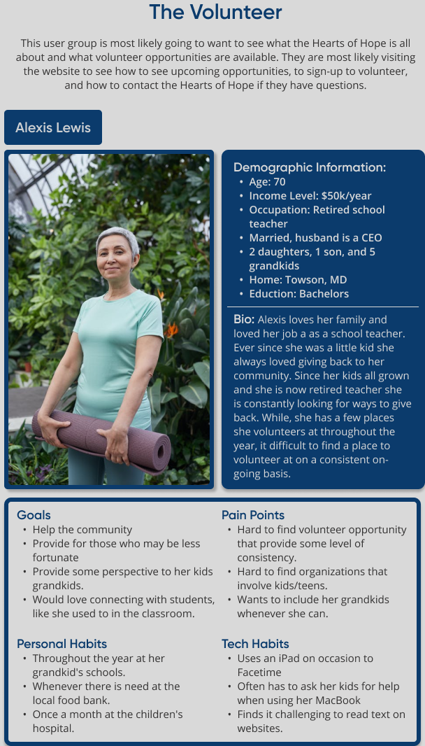
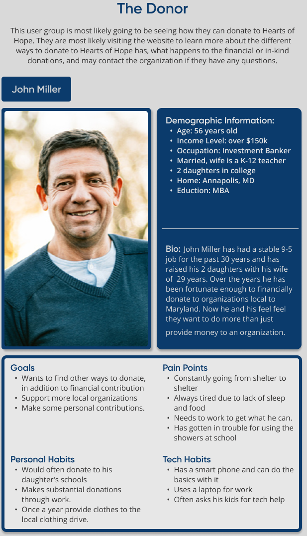
The next part of the research process was to determine the users who are most likely to visit the website. Based on what the organization does and the type of support they need, I determined that there are going to be 3 different user groups: the teen, the volunteer, and the donor.
Information Architecture
Once I had determined who would be most likely to visit website, I created a site map for the current website to determine if any changes were needed to make navigating the site more user friendly. This was a crucial step in the redesign process as one of the goals of the project is to improve navigation.
To create the current site map, I went through the website page by page, taking note of the primary and secondary navigation.
A few points that came up were: there are three categories the programs fall into, donations and volunteers are extremely important as they are mentioned on multiple pages, the events and shop are more ways to support the organization, outside of donations and volunteering, and users are more interested in knowing about who the staff are, rather than who the Board of Directors are, as the staff are the people who they are more likely to interact with.
Keeping these points in mind I created the Revised Site Map to address some of the navigational issues that are in the current navigation:
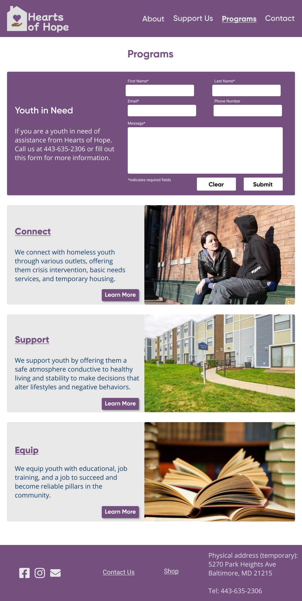
- Programs Page: added the three categories the programs fall into as the secondary navigation and the specific programs as tertiary navigation. This was done to provide clarity on the specifics about each of the three categories of programs that Hearts of Hope has to offer.
- How to Help: I renamed “How to Help” to “Support Us” to guarantee that users know that page has information about the many ways to provide support to the organization.
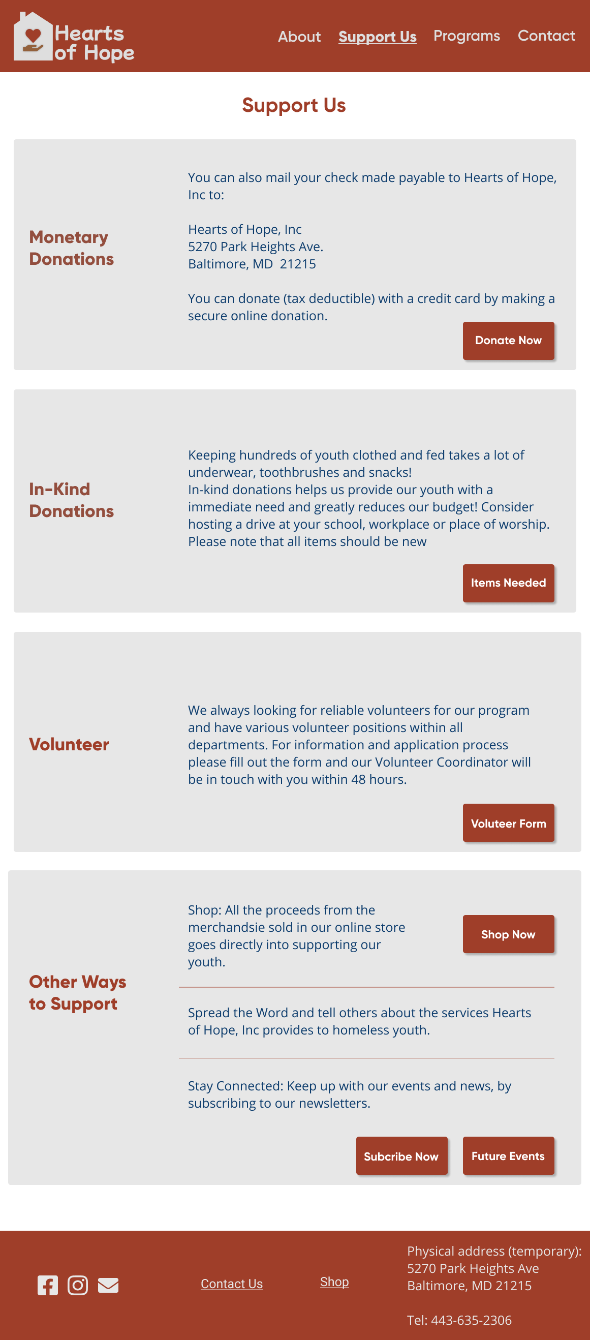
- New Support Us Page: On the “Support Us” page I seperated out the two different types of donations to bring attention to both types and to indicate that both are accepted at Hearts of Hope. I also moved the “Events” and “Shop” to the “Other Ways” to support us section, since at this time, both the events and the shop are additional ways to support the organization, since the events are focused on events around donations and the proceeds from the shop go to supporting the organization.
- Contact Us Page: I moved “Contact Us” from “About” and made it it’s own main navigation link as I think it’s really important that all of the users are easily able to find all the information they may need to contact the organization.
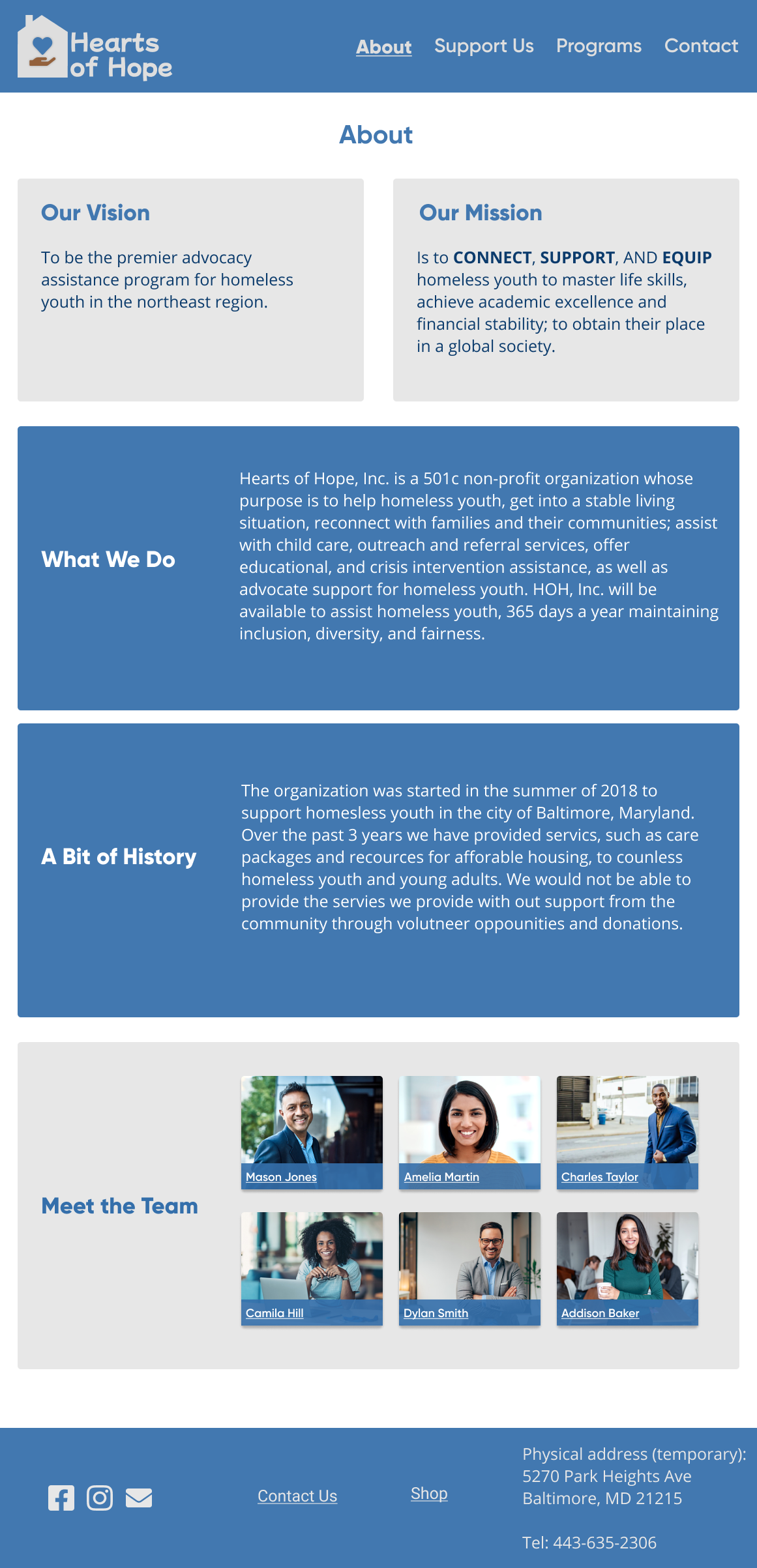
- About Us Refresh: Finally, I rethought the “About Us ” page, since this page provides values information to all three user groups about the organization. Firstly, I changed “About Us” to just “About”,becuase the “us” is understood”. Secondly, I split up the “Overview” from the original design of the “About Us” page and added a few new sections in it’s place, I wanted to make sure all the potential users knew what information they were going to get when visiting this site. Lastly, I replaced Board of Directors with the staff, since they are the ones who are most likely going to be interacting with the users.
Original Sitemap
Revised Sitemap
Lo-Fidelity Wireframes
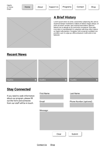
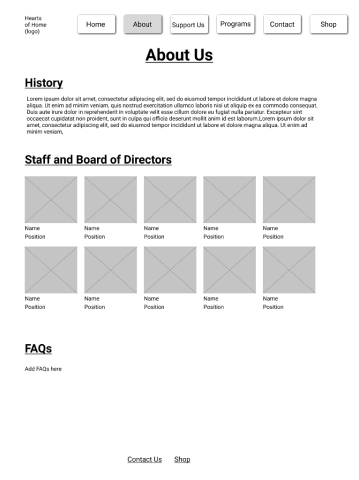
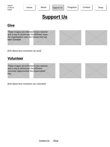
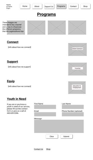
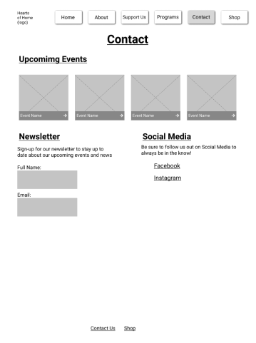
Once I had an idea of how the revised sitemap was going to be laid out, I began working on the lo-fidelity wireframes. The pages I started focusing on for this redesign were Home, About, Programs,Support Us, and Contact. I began with some rough paper/pencil sketches to get some ideas down for the inital layout for the five pages. Once I had a general idea of how each of the pages and the navigation were going look, I digitizied all the pages using grey boxes for image placeholders, and black text just to get an idea of how the pages were going to look and begin laying out content. As I was doing this, I kept the project goals of improving navigation and readility in mind, because at this stage of the process I was able to start focusing in on ways to achieve these goals.
Rebranding
As I started working on the layout of the redesign, I thought about how I change improve the asthetics of the design over all, as well as for the new logo. To really dive into this process I began by creating a mood board.
Mood Board
To create the mood board I started collecting different pictures and ideas I could potntially pull inspiration from for the design of the new logo. I wanted to create a mood board that captured the essence of what the organization is all about. I used images that represent the people that Heart of Hope, hopes to serve and images that include people in some way that represents the message of the organization. As part of this step I created a word dump and some icons that captured the essence of a few of those words. During this process a few words that I kept coming back to included future, hope, heart, home, and connectedness. I kept these ideas in mind as I start collecting things for my mood board.
Logo Development
The words from the intital phase of the branding process and the overall themes of the mood board played a huge role as a I begin sketching out the logo. These words included future, hope, home, and connectedness. These words/ ideas informed how I started creating the logo, my original idea included a rainbow with a house at the end.
However, as I started iterating on this, I realized the idea of the rainbow was not going to fit with user persona of the teen, because as I implemented the rainbow it looked very childish. Also I decided to not use the hand-shaking icon as this felt more corporate, which is not the message the logo I wanted the logo to convey.
Thus, after a few more iterations the final high-fidelity logo incorporated the house, to highlight one of the main goals of the organization, which is to assist with housing, and the hand with the heart in it to represent connectedness with one another. The color scheme I chose for the logo is drawing inspiration from a sunrise, which signifies the future and hope for days ahead. I also felt like this color scheme would be much more welcoming, given that the three user personas are of varying ages and gender-identities
High Fidelity Wireframes
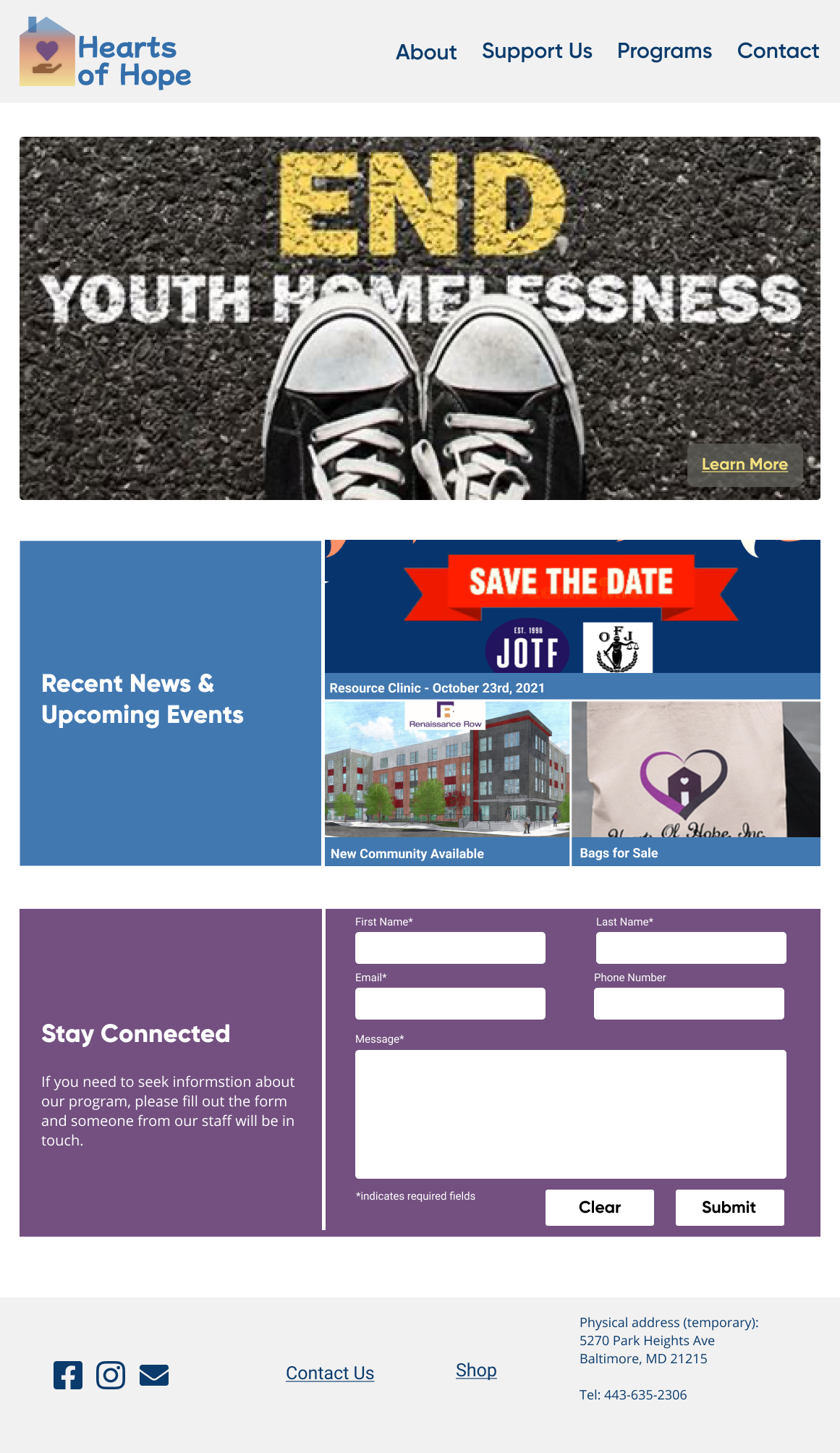
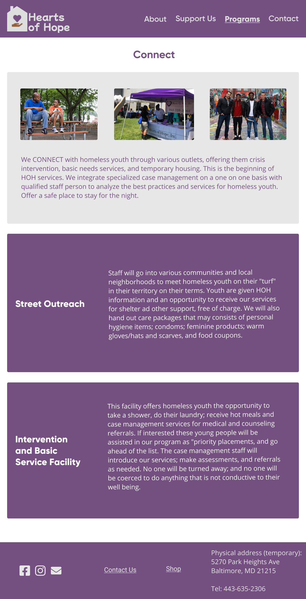
Once I had the high-fidelity logo, the new color palette, and site-map, I moved forward with working on the high fidelity mockups. In the high-fidelity mockup, I worked on implementing the improved navigation, improving readability by making sure there is a clear distinction between the different types of content on the screen, and more aesthetically pleasing by appropriately adding in the color scheme.
In thinking about how to improve the navigation, in addition to making modifications to the navbar, I focused on making sure that the user knows what page they are on and that the title of that page is congruent with content of the page.
In terms of readability I made sure that there was a clear distinction between sub- headers and body text. I also added a background and drop-shadow to most of the buttons to make it clear that they are clickable.
In addition to being asthetically pleasing, the color palette also passed the accessibility test on the color.adobe website. With this and all of these factors in mind I wanted to make sure the website had all the pertinent information of the organization, while also being accessible to all of the users, especially since some of them may not be tech savvy.
I did make a change in the pages I chose to redesign between the lo-fidelity and high- fidelity prototype. This was instead of creating the “Contact Us” page, I created the “Connect” page, to show what a subpage under “Programs” would look like.
