The Problem
The Bert’s Big Adventure Website, in its current form, is a challenge to navigate, has duplicate information in many places, and the layout is not maximizing all of the space available.
The Solution
The redesigned version of the website has a cleaner layout, the navigation is easy to follow, and all the necessary information is still available.
Duration:
3 weeks
Role:
UX Researcher and Designer, Prototyping, Testing
Research
Heuristic Evaluation
We began the research process by conducting a heuristic evaluation on the home page of the website. This helped determine some of the problem areas that we wanted to keep in mind when we started thinking about our redesigned wireframes.
Once the heuristic evaluation was completed we came up with a plan for the user interviews. When conducting user interviews, we wanted to interview users based on their particular reasons for going to the websites. Our plan was to interview donors, volunteers, and beneficiaries of this program.
We were able to interview 2 donors and 2 volunteers, however due to the specific nature of the organization, we were unable to find users to interview that were beneficiaries of the program.
When developing questions we focused on asking general questions related to their past volunteering and donating experiences. We avoided asking specific questions regarding the Bert’s Big Adventure.
Once user research was conducted we created affinity diagrams to categorize all of the information that was collected. Here we have images showing the categories that are most relevant to our overall project.
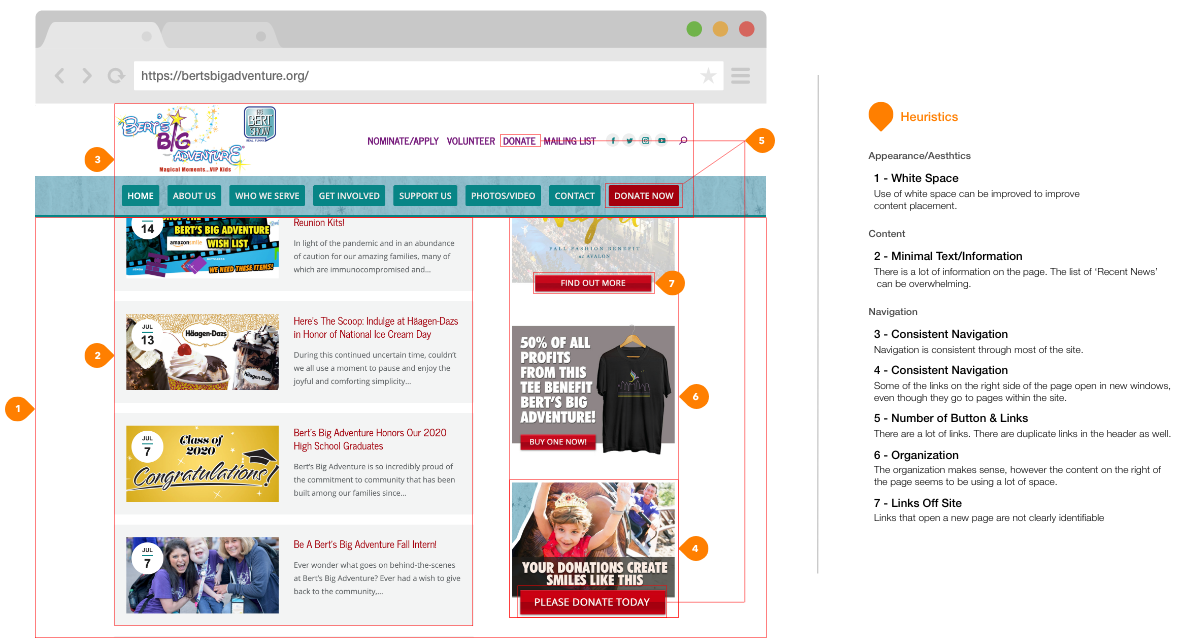
For the heuristic evaluation we focused on the amount of white space on the page, the large quantities of text, particularly as it relates to the “Recent News” section, there are some duplicate links in the main navigation.
User Insights
Volunteer:
Based on our research, we have found that users want to learn more about different organizations before determining where they would like to volunteer. We have also found that users struggle with finding organizations that fit within their schedules.
Based on our research, we have found that users want to learn more about different organizations before determining where they would like to volunteer. We have also found that users struggle with finding organizations that fit within their schedules.
Donor:
Based on our research, we found that users tend to donate more to organizations that help children.
Users also want to be able to donate in other ways, not only monetarily, to make a difference in their communities.
Based on our research, we found that users tend to donate more to organizations that help children.
Users also want to be able to donate in other ways, not only monetarily, to make a difference in their communities.
Problems Statements
Volunteer:
We have observed that users find it difficult to schedule time to volunteer based on their schedules. This causes frustration because users feel that they are not able to help deserving organizations.
We have observed that users find it difficult to schedule time to volunteer based on their schedules. This causes frustration because users feel that they are not able to help deserving organizations.
Donor:
We have observed users think that they can only make financial donations to organizations. This is frustrating because users are looking for other way to help the organization.
We have observed users think that they can only make financial donations to organizations. This is frustrating because users are looking for other way to help the organization.
Lo-Fidelity Wireframes
We created desktop and mobile versions of the low-fidelity wireframe to get an idea of content placement, button states (for the desktop version), and responsive design. We used this set of wireframes for the first round of user testing, and we implemented the result of the user testing in the high-fidelity prototypes.
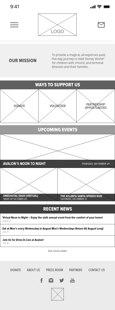
Mobile
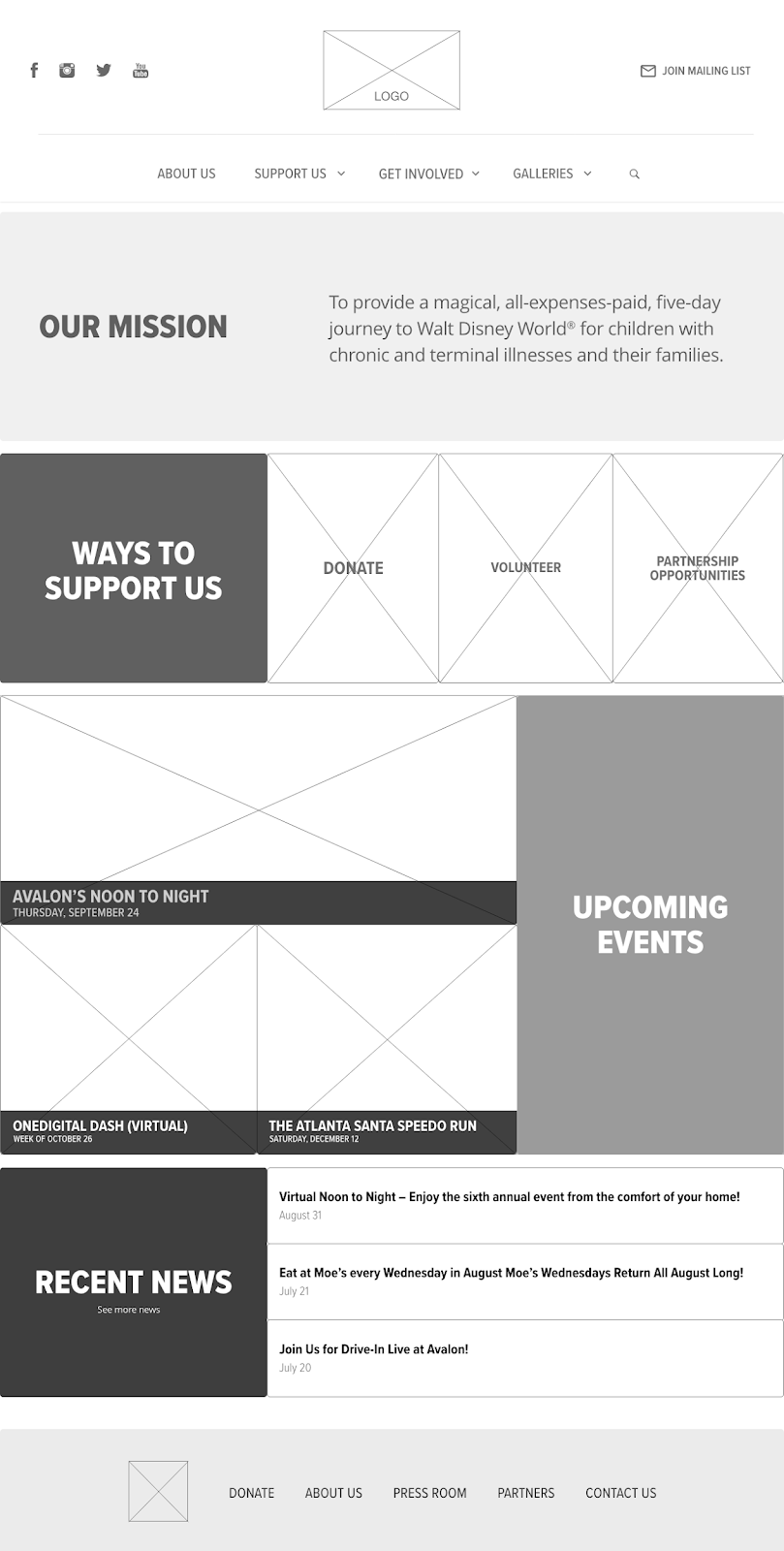
Desktop
Usability Testing
We had the users work through 5 different scenarios to test all of the aspects of the website that are important to the redesign. The five scenarios that we had user go through were:
1. Users scroll through the homepage to see what works and what doesn’t (if anything)
2. Users navigate the site, in order to learn more about the history of the organization.
3. Users have learned more about the organization and are looking for a way to make a donation.
4. Users are looking for ways to get involved and volunteer for this organization.
5. Users either want to nominate a family they know or apply for their own family to be part of this program.
Overall, the results from our testing were fairly positive, we only had a couple of pieces of feedback, which we implemented in the high-fidelity prototype. Those were:
1. Maybe grey out the “About Us” when the navigation is hovered over.
2. Add a shadow behind the lightbox to make it stick out of the rest of the page.
Style Guide and Style Tile
The style tile and style guide are important pieces to the design process as they dictate the style aspects of the high-fidelity prototype. This includes, but is not limited to, the color theory that was used throughout the design, typeface and font sizes choices, as well as button choices. The style guide expands on the style tile and explains why certain design decisions were made. The style guide also shows how some more advanced features could be implemented in the prototype in the future.
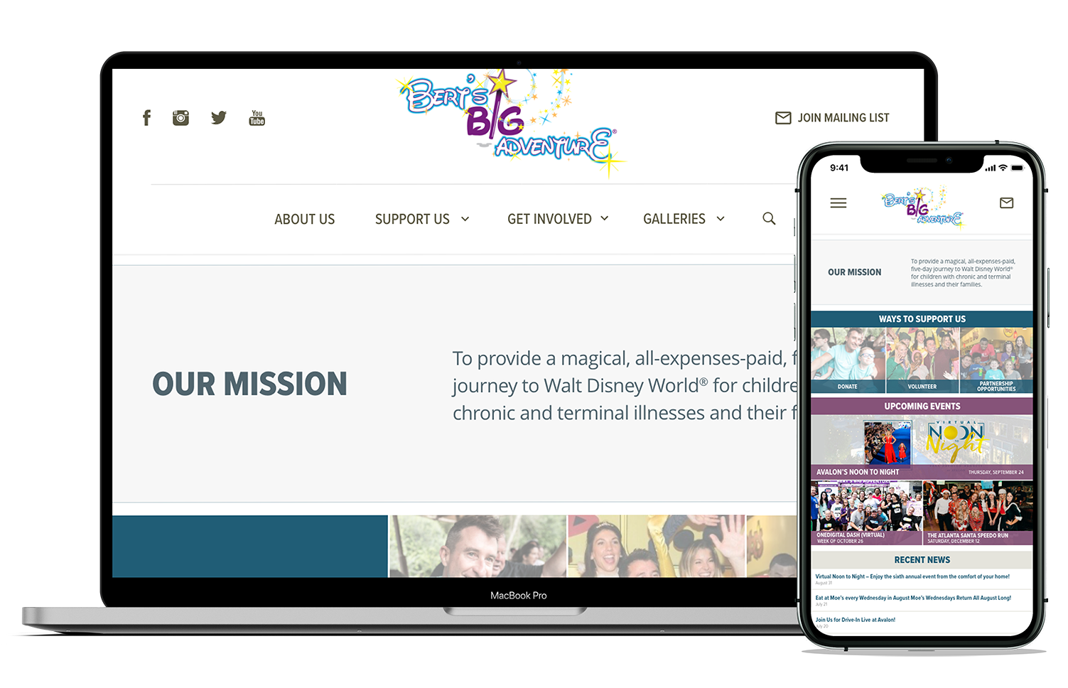
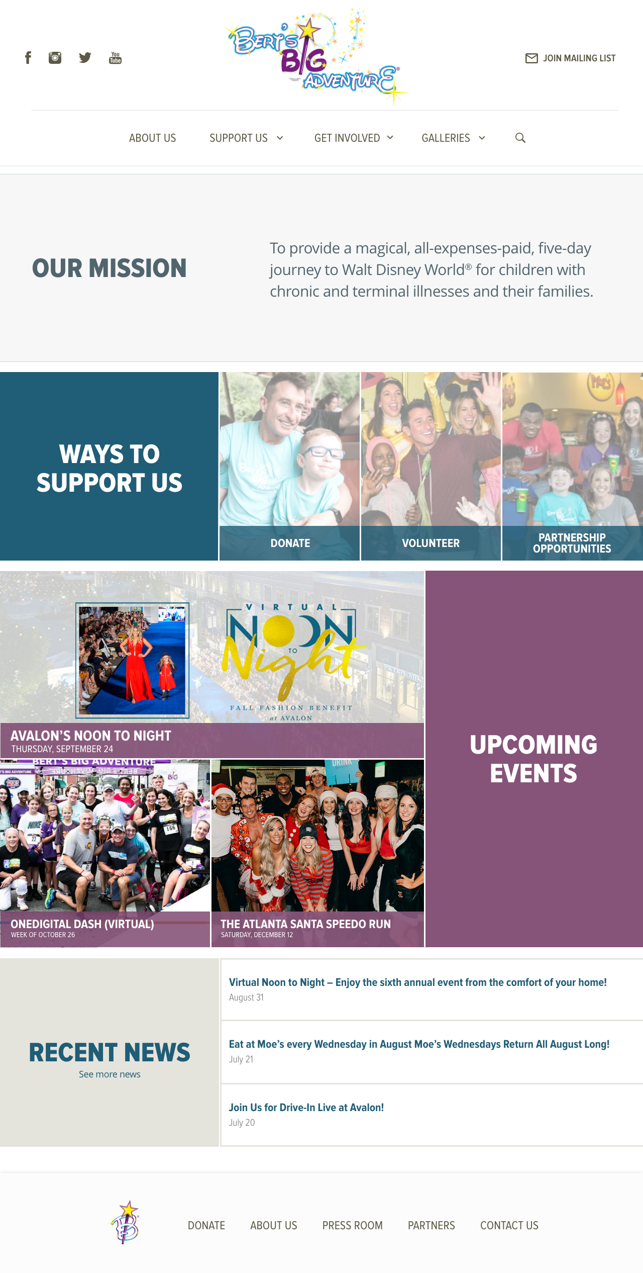
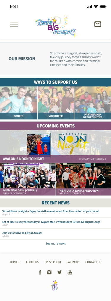
High-Fidelity
In the high-fidelity wire-frames we added color theory, typography choices, and other elements for the style tile. Also for the desktop version we modified the button states to better serve the new look.
Summary
We feel as though the redesigned version has a much cleaner and easy to follow look to it, while still maintaining all of the important content and features on all the pages. As we look towards next steps for this project, we think a few new features could be added, which include: a chat feature, so visitors to the site can talk to the Bert’s Big Adventure staff, a Login/Create Account page, and an Interactive game component.